
Case Studies: Food Roulette
Initial Concept
Food Roulette will be an app that allows people to order a random food when they can't decide what to eat. They input their budget range, the number of people to feed, and any strong likes and dislikes. The program connects to their seamless or grubhub account, or if it gets big enough it can interface with its local partners directly. It will order the surprise food deliverd to your door, letting you choose best of three or a random blind guess based on user reviews, distance, and what you have ordered in the past. This is a great service for the indecisive, people who like surprises, people who want to try something new, and perhaps people under the influence.
Application: Iphone app first.
UX Plan: Determine potential user base and their needs and traits. Design the controls, how the app will glom on to other systems, how the design will best reach its target markets and reward them to promote loyalty and re-use.
Needed to launch: Make a presentation packet to achieve funding, goal is to get purchased by Seamless or Grub Hub to become an app that can be integrated within their system as a fun add on.

Personas
We will be evaluating the site design through the needs of two personas: Mei and Chris
 |  |
|---|
User Stories and
Customer Experience Maps
Going through a user story for Mei and Chris, looking at what the needs of these two different types of users will be with the app. Mei is searching for a healthy meal that's different from her normal fare, and Chris is looking to order multiple meals for an event.
In the customer experience map I am projecting what their experiences might be. With a bigger budget I would like to go back and re-create some of these with user tests. Perhaps with pupil size tracking and verbal feedback about their satisfaction levels at different times, and an incorporation of bounce rates.
 |  |  |
|---|---|---|
 |
SCOPE: SWOT and MoSCoW Analysis
Back to the drawing board with a SWOT and MoSCoW Analysis to help determine what features the app will and won't have. Important features to note are that it should be entertaining and novel to get viral marketing happening. It shouldn't be too broad, to keep it distinct from the many competitors in this field. It won't have a social media aspect.
 |  |
|---|
Determining the sitemap
These are some exercises to figure out our sitemap. I created a spreadsheet to plot what types of food categories the types of users on the site might be looking for. I created a Mental Model for the persona Chris to determine how he will need to interface with the sitemap for his party. An experience tree pairs that with Chris's visited pages in Red. Sometimes doing a mind map can help with realizing places I missed. In this case it helped me realize some things about the companion app I will need to make for the restaurants. That's something to tuck away for designing the restaurant side of the app.
 |  |  |
|---|---|---|
 |
Figuring out the sitemap
Sitemap
Sitemap, first with customer and business side concept, then refined with the app screens
 |  |  |
|---|
Initial Wireframes
Building on the sitemap, The first group of wireframes was hand drawn. In-person testing revealed a need for more food refinement categories. People balked at the food roulette being a surprise in which they wouldn't know what the food being delivered was until it arrived at their doorstep. They wanted that to be clearer before placing the order, and they wanted to know the cost first (or be able to set a cost range first).
 |  |  |
|---|---|---|
 |  |  |
 |
|---|
 |
 |
 |

Third Iteration Wireframes
The second and Third wireframe iterations were done in Basalmiq. These were loaded onto usertesting.com and tested as a clickable InVision Protoype. That prototype has since been updated with changes to the current version.
 |  |  |
|---|---|---|
 |  |  |
 |  |  |
 |  |  |
 |  |  |
 |  |  |
 |  |  |
 |  |  |
 |  |  |
 |  |  |
 |  |  |
 |  |  |
 |  |
User Testing Results
There was an AB Test using the third wireframe iteration [above] on usertesting.com. This was to help answer the question of whether the "Food Roulette" or "Best of Three" function should take precedence in the app.
Group A featured the "Food Roulette" wheel most prominently, where a surprise random food that meets your pre-selected requirements is delivered after spinning the wheel. The customer will see a gambling animation and doesn't know what the food is until they open the bag delivered to their door. Here's a link to the Review by Mr. Dad. Who by the way has such a fantastic voice it's worth a listen just for that.
Group B featured the "Best of Three" spin game most prominently, where three food choices are cued up slot machine style. You could originally only pick from three, but subsequent testing revealed that users wanted to be able to spin multiple times, and recall saved favorites from past spins. Here's a link to the Review of that version by ZaZaZing.
Doing these tests helped me to realize seven things:
-
I need a bubble tutorial for first time users explaining the app.
-
Users will request a broader range of dietary preferences than I realized e.g. Mr. Dad's needs for low salt.
-
On the business app side, we will need a way to communicate these needs clearly to the restaurant and have them label their dishes with tags to help indicate these categories.
-
Also on the business app side, we need a way for them to indicate their turnaround times and busy periods.
-
Both users expressed a strong preference for the pick three being prominent.
-
People like the premise of the app, finding it novel as expected (score!)
-
People confused the "back" button with "reload", I need to make it more clear/ less curvy.
Group Tasks

Gen. Answers A

Gen. Answers B

FOOD ROULETTE
Part II: UI Design
And the winner is...
50's-60's Atomic Age! I got some kind feedback from anyone who would look at these ideas for free, including my very patient colleagues and family. The overall consensus was that we associate the 1950's and 1960's with food, and not so much pachinko parlors. People didn't think the rat pack had to be part of it, so the focus shifted to 50's and 60's diner styles. A bonus of this is that there is a wealth of fantastic copyright-expired illustrations for free use from that time period.
Note: I decided later not to use Arvo or Fontdiner sparkly, keeping to the quick-loading google font "Atomic Age" for the logo and "Lucida Sans" and "Bungee Hairline" for body and accents.

UI Wireframes
This is the first set of UI Wireframes, done in Sketch, and the ones that were tested in the most recent InVision Prototype. Time Constraints led to only doing the most important screens, leaving more to be developed in-kind down the road.
The pictures and animations will all be in restaurant themed atomic age style, from the buttons to the decorative jacks. We can make good use of copyright expired illustrations, like the couple in the TV Below. That will become an animation of the couple which explains why they are ordering from Food Roulette.
Note that the TV theme is heavily influenced by a gif post by a "Roger Wilkerson" alias on Tumbr. I am not sure if this is his original design work or a quotation. If the project gets green lighted I would like to track down the original designer if it is not copyright expired and purchase the rights or perhaps hire them as a design consultant on the project.
 |  |  |
|---|---|---|
 |  |  |
 |  |  |
 |  |  |
Setting the Mood Boards
The initial mood boards were steering the app in two very different design directions: Rat Pack vs. Pachinko parlor. The app is called Food Roulette, after all, and features a gambling motif and interactive gambling-style animations when selecting dishes. This led to a disconnect between those two: Rat Pack Las Vegas style gambling in the 50's-60's vs. the contemporary flashy lights seen in the contemporary Pachinko style gambling aesthetic.
Runoff Election
 |  |
|---|
User Testing
This prototype was tested on Usertesting.com by user SCasey444. Ideally I would have liked to test with at least six people, but this project has a very small budget until it gets green lighted so one will have to do. Here is the link to the video recording of that test. It confirmed that I need the introductory video to explain the site and pop up bubbles for first time users.
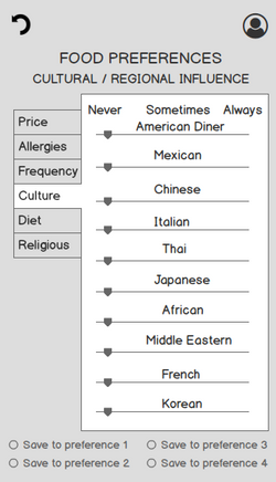
She enjoyed the multi-roll option from "Pick Three" and was delighted to be offered food preference settings. "This is so cool, I've never seen this on any other website," she said about choosing her food preferences.
She had some good suggestions about streamlining the billing and shipping addresses and the order in which those could appear. She also wants a button or gesture that will take users straight back to "home" in the app. I agree that could be a good feature.
User Tasks

Gen. Answers

Conclusion
The UI screens can be updated with those suggestions and the missing screens filled in with new designs. This will be used along with a presentation deck accompanied by an InVision prototype with those updated screens.
Competitive analysis revealed that there is an existing food roulette app, although it is not functional and has a different concept and function. We may have to change the name or partner with the existing app going forward.
I would like to start shopping around for either startup capital, or even better, acquisition on this project. Having this app might help an existing company such as Grub Hub or Seamless get an edge in the market by taking on this app/these features as a novelty way of ordering food.
Once funding has been acquired we will need to design the food service and delivery side of the app, and figure out how to motivate those business partners to enter and keep the food ingredient details updated for the dishes offered through the app. This will be easier if we are acquired and can tap into an existing vendor network.
